Spatial Interfaces
August 30, 2019
Think about this: there is no app that replicates a deck of cards.
Go ahead and look on the app store, and you'll find a bunch of apps with bad reviews and extremely limited functionality.
Why is that? A deck of cards consists of so many objects, that can be used in so many ways, amongst so many players, that there are almost infinite ways to use them. It's so complicated to think about designing an app to replicate the full functionality of a deck of cards, that still, no one has done it.
You would need to be able to shuffle the deck. You would need to be able to cut the deck. To deal cards. To stack cards in any different number of piles. To reveal cards, to all the players or just to specific players. To lay the cards down in so many different arrangements for different games. Stacks of cards facing down. Stacks where only the top card is visible. Stacks of cards that you can draw from.
If you start designing a deck of cards app as a traditional 2D app the way we think about them today, with 2D panes and menus and buttons, it becomes painfully difficult to think about.
But what about in 3D? It seems that the only way to build an app that replicates the full functionality a deck of cards is to build a 3D simulation or game. Model the cards in 3D and put them on a 3D table. As long as you have controls for reaching out and picking up the cards, and moving them in space, you can do anything you can do in real life.
Preserving the higher dimensionality makes it simpler and more intuitive, not less.
Spatial thinking in design
Historically, it has seemed obvious that displaying things in 2D, and therefore reducing dimensionality, makes them easier to understand. We design software as flat, 2D planes, rather than showing depth in space, because it is simpler and appears on 2D screens. 3D menus and forms would be a pain, so we reduce the dimensionality.
And if reducing the dimensionality of a concept to 2D doesn't lose any of the nature of the information you're transforming, that transformation simplifies it and creates order. We can see this in examples like galleries of images, menus with buttons, forms with columns of text inputs, etc. Most of the software we use today, in fact, is two-dimensional. 2D interfaces living on 2D screens.
It turns out that there are some applications where increasing the dimensionality to 3D (or leaving them in their original 3D form, like in the deck of cards example) can make the applications more intuitive. I think this is going to be a major force in the near future of software.
Why now? There are two main reasons.
First, we tend to associate these concepts with gaming, and gaming is growing extremely fast. A certain kind of UX is usually conflated with "gaming" in our minds: spatial environments, often in 3D, populated by 3D avatars that move, interact, and relate to each other in space. But this isn't just "gaming." This is actually a kind of user experience that can be used for non-game applications. The recent popularity of gaming and e-sports will make us start paying more and more attention to the power of this kind of UX, and we'll soon realize that we can take this kind of design outside of game applications.
Second, we're at a turning point with the ease of 3D programming, animation software, and the browser's ability to render 3D graphics. Creators now have a variety of tools at their disposal for making spatial software: WebGL, Three JS, Unity, Unreal, etc. This is something that software designers should seriously consider.
Spatial Affordances
Humans are spatial creatures. We experience most of life in relation to space. We sit in a circle with our family. We drive down the left side of the road in Ireland and try to stay in our lane. We ride scooters down a path along the water. We sculpt a human body out of stone. We follow signs to our train. We walk, through arches, or on crosswalks beside bike lanes, or to follow our brother across a bridge. We position our camera to frame the shot while our friend leans out over a balcony. We sense ourselves in space in relation to all of the other objects in our environment.
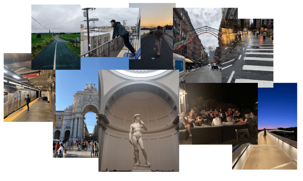
And this is powerful knowledge that we've left out of lots of software. In fact, while most obvious in 3D, this thinking does work outside of just three-dimensional software. Almost any software can use spatial concepts to become easier to understand.
In particular, some applications use spatial relationships to suggest how they should be used. Incarnations of this thinking are called spatial affordances.
This term has typically been applied to fields like wayfinding and mapping, but it can apply to many areas of software design as well. Spatial affordances in software use our intuitive understandings of spatial relationships to make sense of what UI elements do, and are just one way to use spatial thinking to design software.
A bike lane affords a place to ride a bike. A subway sign affords walking left or right. Empty space on the iOS home screen affords a place to put another app icon.
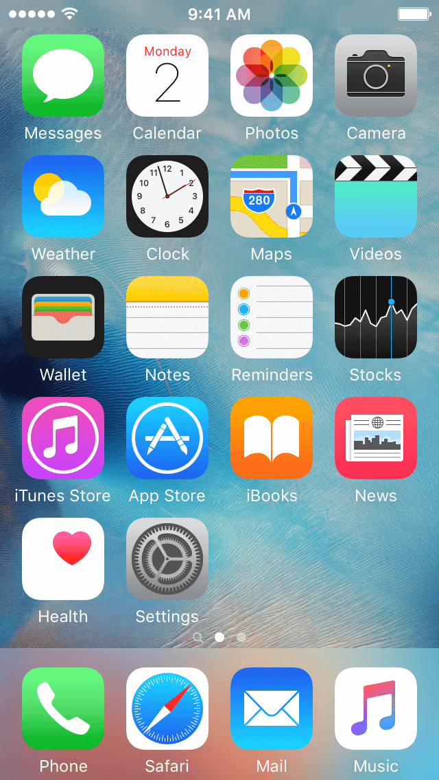
Skeuomorphic Spatial Affordances
Software designers already familiar with skeuomorphic design, which aims to give users affordances for what UI elements do by making them visually represent real-world counterparts. Take the iOS 6 Notes icon, for example. It looks like a real notepad, down to the pages that have been torn out.

Sometimes, a spatial affordance can be an instance of skeuomorphic design. This occurs when the spatial affordance directly analogizes the real world, as in skeuomorphism.
If skeuomorphism is making UI elements represent their real-world counterparts, skeuomorphic spatial affordance is making UI elements represent their real-world counterparts and their spatial relationships to their surroundings.
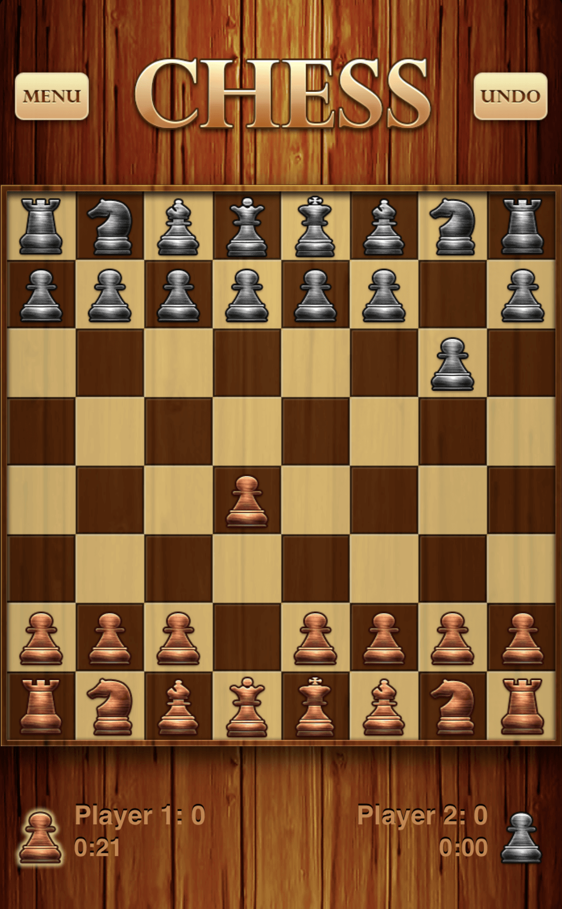
Here, the concept of representing the real world in software extends beyond each UI element itself, as in skeuomorphism, and into its surrounding environment.
Understanding skeuomorphic spatial affordances as a user requires very little mental overhead, since they mimic the real world very closely. However, skeuomorphic spatial affordances are rare in most software today. Why? Because it's hard to directly analogize the real, three-dimensional world in two dimensions.
This will change as 3D software design moves from gaming into mainstream applications. There is much unexplored territory where skeuomorphic spatial affordances can make our lives easier, solving problems by simulating real world spaces. The deck of cards is an example where only a skeuomorphic spatial interface will do.
Using spatial interfaces in design
Spatial interfaces can go beyond just spatial affordances, and it should be noted that spatial thinking has not been completely ignored in software. Early app design increasingly moved towards spatial concepts for navigation. Today, most apps use some spatial concepts to make it easier to understand how to get back to certain screens. One example is "stacking" screens on top of each other as the user progresses, letting them go back to previous locations easily.
Snapchat is an example of an app with completely spatial navigation. The user swipes in different directions to navigate to different screens, which are laid out beside, above, or below each other in 2D.
Even in this video from the early days of Snapchat, Evan talks about navigation spatially. "To the left of the camera there's a list of all of your chats."
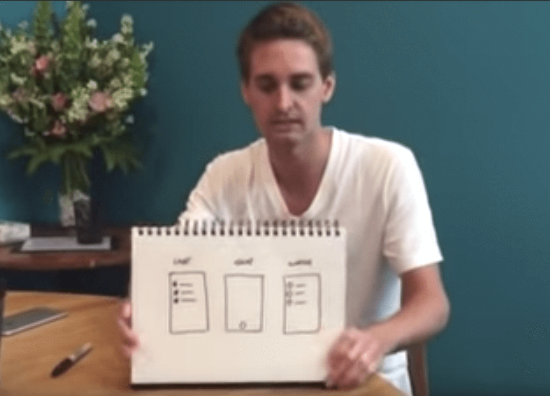
Now some examples and ideas for spatial affordances in different software applications.
Calendars
Suppose I work at a company and I want to find out, "Who is everyone at my company meeting with right now?" With only Google Calendar at my disposal, this task is a nightmare. I have to load each person's calendar and one by one, click into their current meeting to see the list of attendees. Writing names down as I go, I click back to the calendar and then into another event, over and over, until I've collated all the names of who is meeting with whom.
Contrast that experience with this one. I recently used a piece of software called Sococo. It's a "virtual office for remote teams." It's just a 2D floor plan of an office, with a bird's eye view. Every employee has an avatar. You can simply place your avatar in one of the rooms with other people. The room provides text and video chat for the people inside.
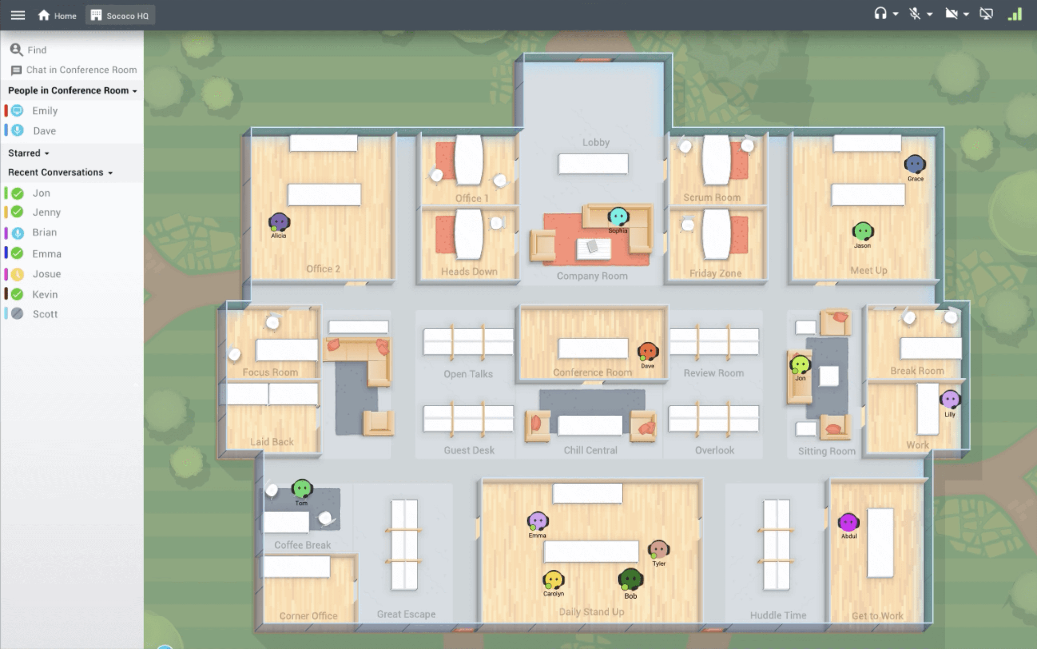
Now try to answer the same question with this software. "Who is everyone at my company meeting with right now?" All of a sudden, it's extremely easy. You just look at the rooms. At a glance, it's immediately obvious which people are working together. The floor plan is a skeuomorphic spatial affordance, one of the few I can recall seeing. It displays rich information and makes that information easier to understand by analogizing a real-world spatial environment.
I should point out that you don't even need Sococo to get this affordance. Google Calendar could generate a visual floor plan and populate it with avatars based on all the meetings happening inside the organization.
Meetings
Video conferencing UX is broken, and there's a lot of greenfield for spatial thinking in the space. All of the innovation in this field has been around transmitting video, or quickly generating URL's for new meetings. But even Zoom, hailed as the best product for video calls, is limited by its interfaces.
For example, there are only two ways to view a meeting: Speaker View or Gallery View. When in real life are you ever looking at a grid of faces? Never. It's not natural.
In real life, you look at people around a dinner table, or around a circle at a standup meeting, or at someone beside you as you go for a walk. Video conferencing software removes all of those spatial elements and therefore makes meetings more complicated.
There could be a new video conferencing company that builds spatial interfaces for all different kinds of meetings. Take standups for example.
When you run a standup at a technology company, you typically go around a circle and each person gives their daily update. But in Zoom, there is no circle. You get confused about who is next. Two people start speaking at the same time. It's awkward and confusing. Eventually, you realize that one person, probably the manager, just has to dictate who goes next, at the risk of seeming bossy.
Spatial thinking can make this easier. At the very least, you could show small ring of attendees' avatars to represent the circle. It doesn't even need to be in 3D. It could just be a circle of emojis.
You could also design things like an interface that can pan left and right to see different people's faces as if you were standing in a circle. Different spatial interfaces could make it easier to run all kinds of meetings.
Messaging
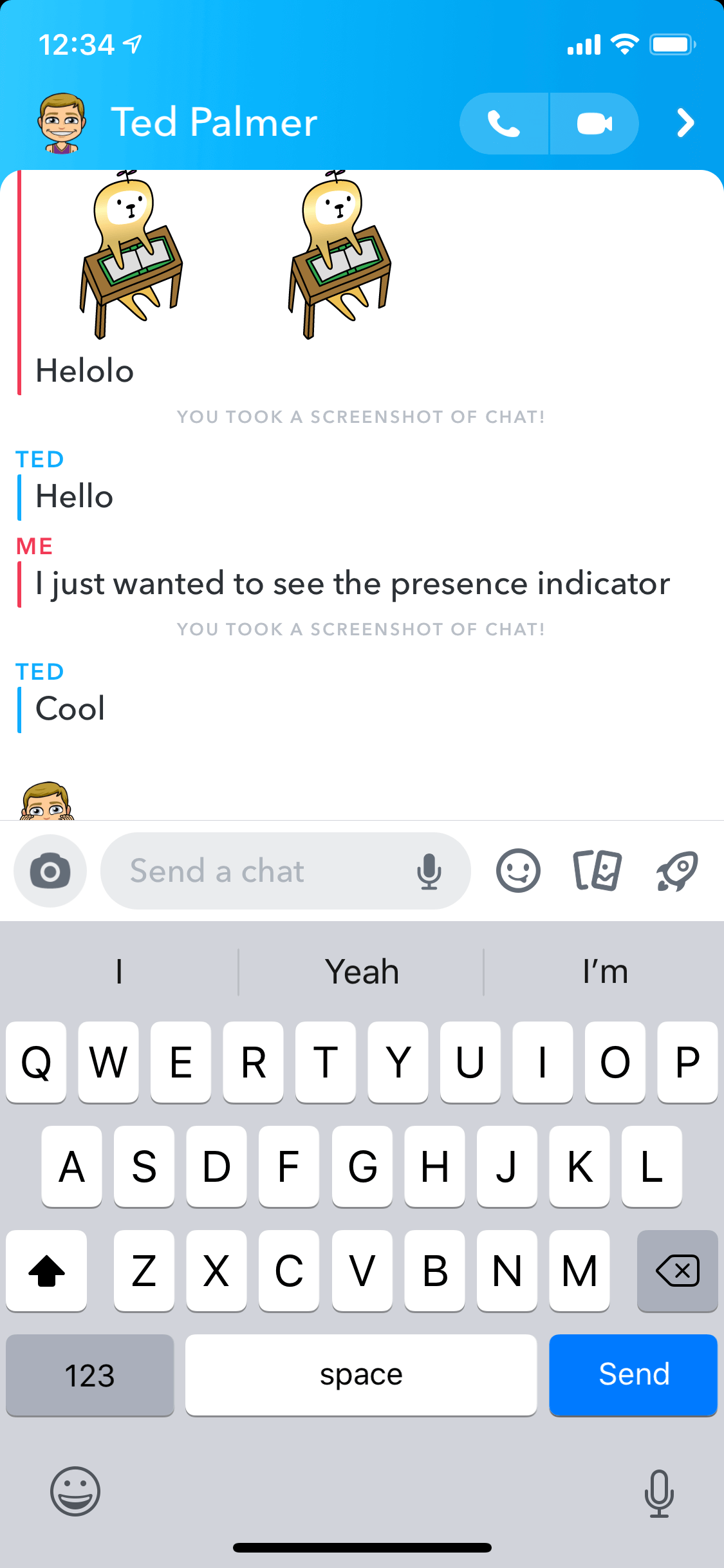
Spatial thinking can be powerful in social software by establishing a stronger feeling of closeness. In games, unlike most social software, the concept of "presence" is at the forefront. But again, spatial affordances don't always need to be in 3D. Snapchat has its famous presence indicator, now in the form of Bitmoji, that lets you know when the other person is "in the chat" with you.
Surprisingly, some software with spatial concepts built in can be used reasonably well for social interaction, even if not the intended purpose. I recently tried using Figma to hang out with friends in the evening due to its sense of presence. Live cursor positions let us all know that we were actively participating. In fact, as we did this together, we immediately began drawing bodies for ourselves, with chat bubbles to type into. This produced a much stronger feeling of togetherness and emotional connection.
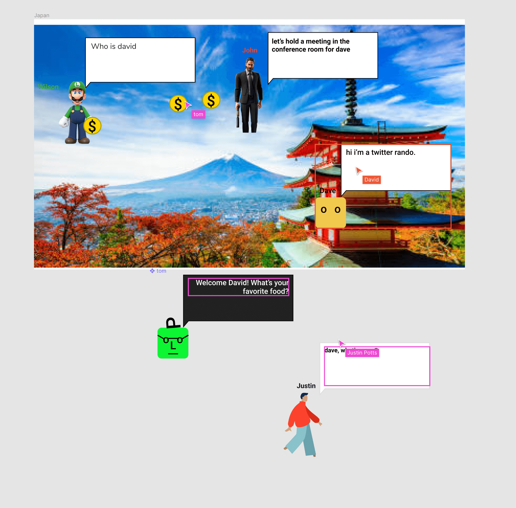
One big difference here is the inclusion of a body and the ability to arrange our characters near each other. In real life, a voice does not emanate from thin air. A voice comes from a body. Seeing this in our hangouts in Figma was powerful in some way, though not refined.
Back when I worked at Snapchat, I formulated an app idea based on the same notion: spatially representing the way speaking to someone feels in person.
When we talk in real life, our words do not stack on top of each other in a scrolling list. They're more ephemeral than that. Our words hang in the air between us until the next person speaks. I had never designed anything back then, but I downloaded Sketch and drew out this rough concept.
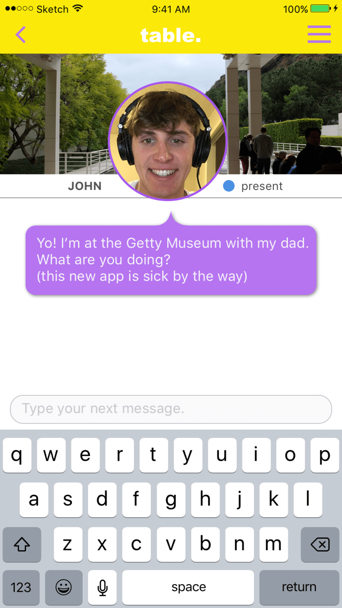
In this concept, the person you're messaging with is shown "across the table" from you. There can only ever be one chat bubble in between you. Every time someone types some text and presses enter, the bubble is replaced with the latest message.
Throughout my time at Snapchat, I actually designed and proposed a number of features based on spatial thinking, but none of them were ever built.
Web browsing
Over time there have been many different ways of thinking about navigating the Internet spatially. Surfing the web, a series of tubes, hyperlinks as portals to other pages, etc.
Well, these spatial concepts can be translated into interesting UI innovations. We already have concepts like "back" and "forward" for navigation (we also have "cut" and "paste," terms taken from the practice of manuscript editing, where one would literally cut out a snippet from one page and paste it onto another). There's more room for spatial concepts to become part of our web browsing experience.
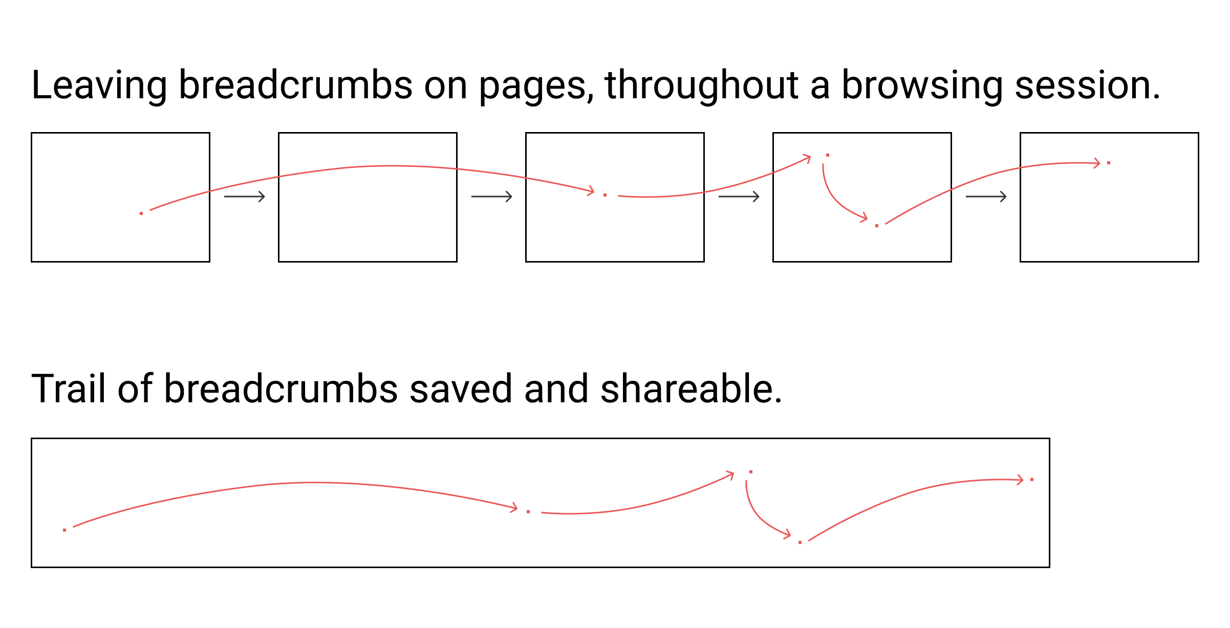
One example is an idea I call "trails." It's based on the story of Hansel and Gretel walking through the forest and leaving a trail of breadcrumbs behind them, so that they could find their way back later. What if you could do this on the web?
A breadcrumb in this case is a single pixel that you can place in a precise location on a webpage. Placing a breadcrumb could be as simple as Option + click. While navigating the web, you could leave breadcrumbs on different pages you find interesting over the course of a browsing session. When you're done, that sequential "trail of breadcrumbs" would be saved. You could then jump back into the trail and navigate "forward" and "backward" through the things you found interesting in that browsing session. Or share the trail with a friend, and they could step through your spatial path of navigating the web.
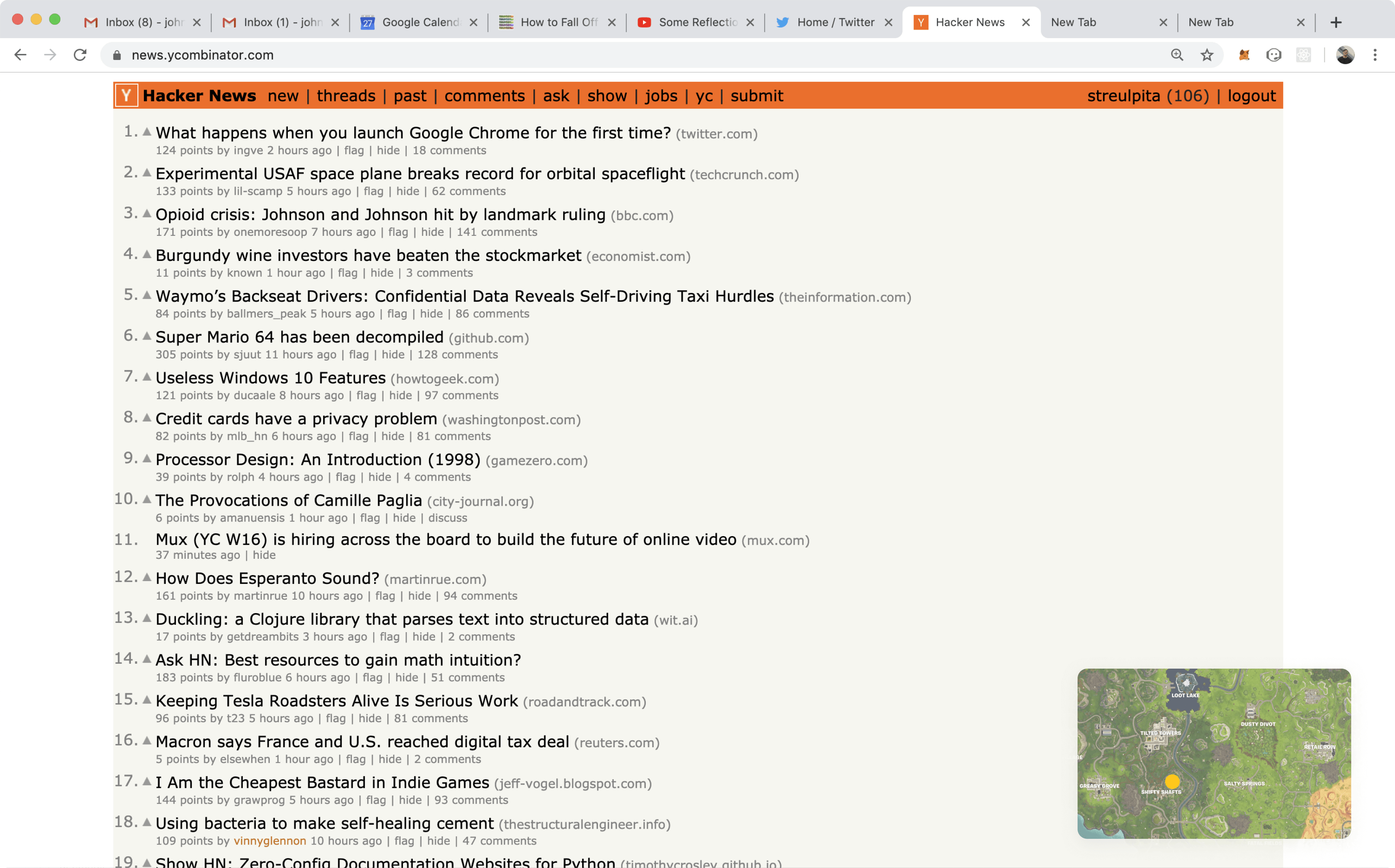
Another idea for spatial thinking on the Internet is creating a spatial map. We talk about "Crypto Twitter" or "VC Twitter" as concepts. But don't they feel a bit like places? What if we had a map of the Internet? You could build a Chrome extension that acts as a little hovering map down in the bottom-right corner of any window. Like in an RPG, it could show your current location on the map and what's nearby, with the ability to teleport to any location, or just walk around. The owners of domain names could choose where on the map their domain is placed.
I could place my personal site on a street near the websites of my friends. We could form a little village. I could then go to my favorite sites and walk around nearby to find sites like them. This is a spatial interface that would give us a new and intuitive way for navigating the Internet and understanding how websites are related each other.
Conferences
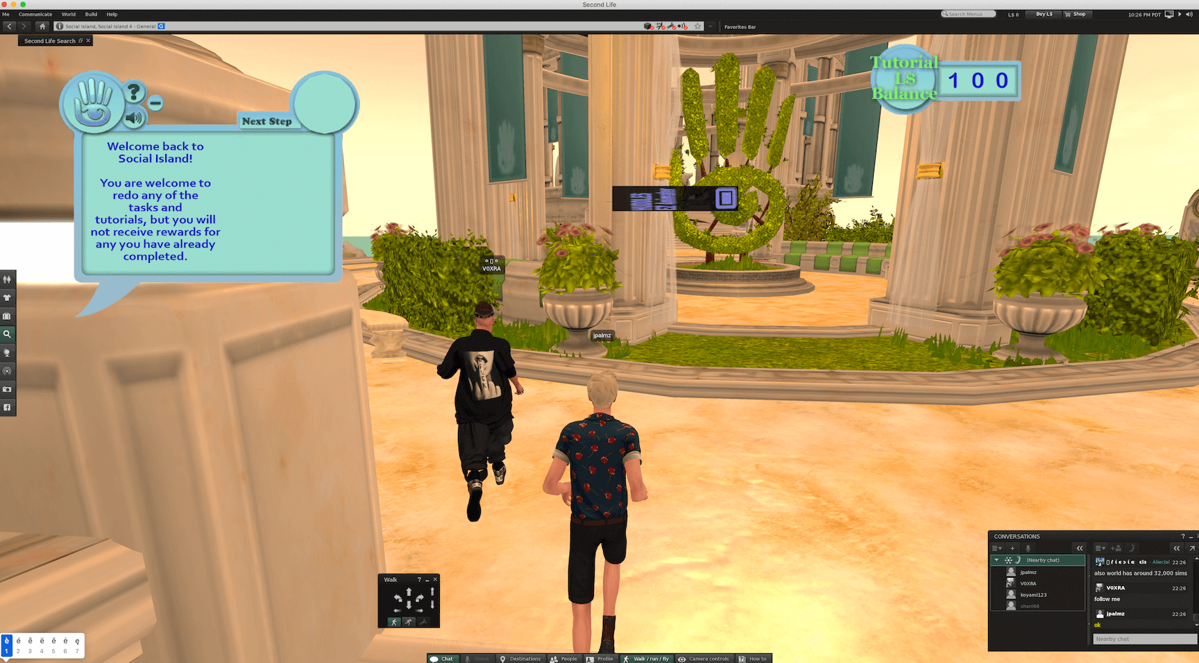
Some of the best parts of conferences happen outside of the scheduled programming. The magic is in the unexpected interactions with people you bump into. You could build a "conference simulator," a lot like a video game, and gain the ability to run conferences remotely.
You would attend a conference in the game and socialize with other attendees. You'd go take your seat for the speakers. You might even strike up a conversation with the person seated next to you. The ability to run conferences this way would make them easier to attend and better for the environment. Second Life was a piece of software that understood using gaming for this kind of socialization.
To conferences and beyond
While all the examples above are compelling, and lots of the software we already use can be augmented by spatial interfaces, I think there's something bigger on the horizon. I can tell by the way these examples make me feel.
Why does that final example, the conference simulator, feel different from all the others? Why does that image from Second Life make me more excited? It feels more real. Is this a skeuomorphic spatial affordance? What does skeuomorphism even mean when you can completely replicate the real world from scratch in your application?
It's almost like that image could fit into the collage of photographs from up above. It's not just spatial affordances making an app more intuitive. It's a completely new world of its own.
Until today, creating new worlds and environments in software has been a specialized field, mostly constrained to the gaming and animation industries. But with new tools at our disposal and the power of spatial interfaces becoming harder to ignore, it won't remain this way for long. We're already noticing the signs. People start teaching their kids at a school inside of Second Life. Marshmello plays a concert to a live crowd in Fortnite. Movie theaters get converted to virtual playgrounds. Employees start working together in VR.
Game-like interfaces could be incredible for almost any social use-case, not just for running conferences. However, these interfaces are usually combined with a competitive objective. What if they weren't?
We could have games for anything. Games for attending classes, co-working, and making art. Games for work. Games for just hanging out. We're going to make these kinds of games. But at this point, it's time we stop thinking about them as games and start considering them part of a broader field: spatial interfaces.
Additional notes
Thanks Toby Shorin and Wilson Cusack for help editing this essay.
Are you an investor or startup doing research in this space? Reach out to talk more at johnpalmer93@gmail.com
Get an email when I publish a new essay